When required, Progress Housing Group uses a strapline - a descriptor that we feel epitomises our brand promise and helps us to stand out from the crowd.
This is available in two colours and can sit with the logo or apart as per the examples below.

This refers predominantly to the logo, its elements and its appearance. The position and proportion of these in relation to each other - and to other elements on the page - have been carefully considered and will enable you to accurately reproduce Progress Housing Group’s brand style on all communication and promotional materials.
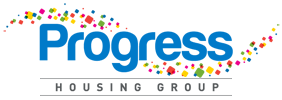
The Progress Housing Group logo is made up of a range of elements. These ‘building blocks’ are the basic components you need to begin applying the Progress Housing Group brand identity. The logotype (or logo) is the most basic visual representation of the brand identity.
More than just a ‘badge’, it encapsulates all of our values, provides us with an identity and is the keystone on which we build a whole brand personality.
The Progress Housing Group logo is made up of three basic elements - the ‘boxed swirl’, the ‘Namestyle’ and the ‘Housing Group’ descriptor.
These have been designed to work together as a unit and their scale and proportions have been carefully planned to allow maximum clarity, impact and flexibility of use.
To protect the corporate mark (the logo) it should not appear in any other colour or form than those stated in these guidelines.

When required, Progress Housing Group uses a strapline - a descriptor that we feel epitomises our brand promise and helps us to stand out from the crowd.
This is available in two colours and can sit with the logo or apart as per the examples below.

Live chat with a friendly advisor
Email or call us