Skip to main content Skip to footer

Typeface

Type is a ‘visual language’ and, as such, dictates the way in which we speak ‘visually’ to our tenants/customers and the world at large.

The typefaces that ‘speak’ for Progress Housing Group have been specially chosen to complement our brand styling and communicate our messages in a clear and distinctive way.

Arial is used for all internally-produced print and digital documents including emails, flyers, PowerPoint, letters, reports and minutes.

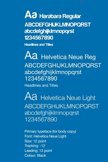
The Helvetica Neue family and Harabara Regular (for headings only) are the primary typefaces for all Progress Housing Group communications and should be used for all professionally produced materials, including newsletters, leaflets, annual reports and advertising, reinforcing the consistency of our brand identity.

Overview

The standard font for body copy is Helvetica Neue Light size 12 point. This is a minimum size to ensure that all text can be read clearly. Please note that larger font sizes may be used when contacting tenants/customers or tenant/customer groups with specific communication needs.

AGENCY USE ONLY: When setting this typeface please adjust the tracking to ensure that the characters are sitting quite tightly together. For example, in Adobe InDesign the tracking should be set to -12 and, for 12 point text, the leading should be set to 13 point.

In the majority of publications the colour of the typeface will be black. However, Progress Housing Group Blue and the other colours of the brand palette may be used for titles or to highlight key words or phrases. Please note that Progress Housing Group Yellow text should not be used against a white background unless the text is bold and large enough to be clearly read.

Helvetica Neue font can be used in Regular, Light, Condensed, Bold, Roman and Black.

Our general principle is that WordArt should not be used as it is difficult to read and can devalue a document or presentation.

The standard font for body copy is Helvetica Neue Light size 12 point. This is a minimum size to ensure that all text can be read clearly.


Primary corporate typeface - Helvetica Neue

System typeface - Arial

Professional documents

Internal documents

Newsletters

Emails

Leaflets

Letters

Annual reports

Agendas

Adverts

Minutes

Promotional items

Board reports

Sales literature

Policies

Signage

Procedures

Vehicle livery

Memos


PowerPoint presentations


Flyers


Strategy documents


Appraisals


Websites


No other fonts should be used, such as serif typefaces (eg Times New Roman) or script typefaces (eg Comic Sans, Brush Script).

Get in touch

Live chat with a friendly advisor

Email or call us